How to make a custom view in Xamarin Android
Feb 14 2018 • 5 mins read
I’ve written a lot of custom* views. Custom with an asterisk because in reality they were all a combination of already existing android views (compound views). Recently however, I had to write an entirely new view from scratch for a project I was working on so this tutorial would be an easy-to-follow guide on how to write your own custom view for use in your Xamarin Android applications.
In this tutorial, we’ll be using C# with Xamarin.Android to write our custom view. The knowledge here however, still is easily transferable to other languages like Java.
You can choose to write a custom view in a separate Xamarin Android class library project or in your existing Xamarin Android app project. In this tutorial, we’ll be writing our custom view in an existing Xamarin Android app project.
Here’s what we’ll be building: IconView
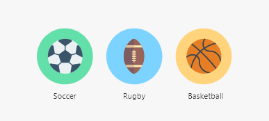
An IconView is essentially an image view with custom backgrounds.
Let’s get to it then shall we?
Setting up
I like to keep my project clean so I often create folders to hold related items/classes. Since we’ll be building a custom view, go ahead and add a folder called “Views” to your project folder.
In your Views folder, add a new class with the name of what your custom view would be called. Mine is “IconView”. The naming convention is usually {YOUR_VIEW_NAME}-View. Examples include ImageView, TextView, CircleImageView, CalendarView etc.
You can inherit from any other view and that usually makes your life easier because a lot of the work would have already been done for you. However, if you’re writing an entirely custom view from scratch you should inherit from the View class.
using Android.Views;

public class IconView : View
{
}
At this point, you should think of what attributes users of your custom view can set, either through layout xml or programmatically. For IconView the attributes users can set include;
- bg_color: The background color of the IconView
- src: The image to show in the IconView
- iconLabelText: The text to show as the icon label
- iconLabelTextColor: The color of the icon label text
- showIconLabel: Boolean that decides whether the IconView should show or hide the icon label
The next step is to declare these attributes as styleable in your attrs.xml. Navigate to {YOUR_PROJECT_NAME}/Resources/values. If you don’t already have an attrs.xml file in that folder, simply add a new xml file named "attrs".
After adding your attrs.xml file. You need to declare your custom view as a styleable entity. To do that add the following to your attrs.xml;
<declare-styleable name="{YOUR_VIEW_NAME}">

</declare-styleable>
Now, we need to also declare the attributes we thought up earlier as styleable attributes. To do that, we need to first understand how styleable attributes are declared. Here’s an example of a styleable attribute for IconView;
<attr name="bg_color" format="color" />
Name: This is the name of the attribute for your custom view. Users set the value for the attribute in their layout xml using the name property. Example:
app:bg_color="@color/iconview_bg_color"
Format: This is the format/data type of your attribute. Here are all the formats possible for styleable attributes: reference, string, color, dimension, boolean, integer, float, fraction, enum, flag.
At the end of this process here’s what my attrs.xml looked like:
<declare-styleable name="IconView">
    <attr name="bg_color" format="color" />
    <attr name="src" format="integer" />
    <attr name="showIconLabel" format="boolean" />
    <attr name="iconLabelTextColor" format="color" />
    <attr name="iconLabelText" format="string" />
</declare-styleable>
Well well well. Good job. We’re finally done with setup.
It’s time to write some cooodeeee!
Writing code
The first thing you need to do after sub-classing the View class is overriding two of its constructors. For me, here’s what that looked like.
The constructor below is called when a view is being inflated programmatically.
public IconView(Context context) : base(context)
The constructor below is called when a view is inflated from defined layout xml. When a view is created from an XML layout, all of the attributes in the XML tag are read from the resource bundle and passed into the view’s constructor as an IAttributeSet.
public IconView(Context context, IAttributeSet attrs) : base(context, attrs)
1. Initialize
I usually define a single entry point for these constructors where I initialize everything required for the custom view. The single entry point is a method I call "Initialize".
protected IconView(IntPtr javaReference, JniHandleOwnership transfer) : base(javaReference, transfer)
{
}

public IconView(Context context) : base(context)
{
    Initialize(context);
}

public IconView(Context context, IAttributeSet attrs) : base(context, attrs)
{
    Initialize(context, attrs);
}

private void Initialize(Context context, IAttributeSet attrs = null)
{
    if (attrs != null)
    {
        // Contains the values set for the styleable attributes you declared in your attrs.xml
        var array = context.ObtainStyledAttributes(attrs, Resource.Styleable.IconView, 0, 0);

        iconBackgroundColor = array.GetColor(Resource.Styleable.IconView_bg_color, Color.Gray);
        iconLabelTextColor = array.GetColor(Resource.Styleable.IconView_iconLabelTextColor, Color.ParseColor("#D9000000"));
        _labelText = array.GetString(Resource.Styleable.IconView_iconLabelText);
        _showIconLabel = array.GetBoolean(Resource.Styleable.IconView_showIconLabel, false);

        var iconResId = array.GetResourceId(Resource.Styleable.IconView_src, 0);
        if (iconResId != 0) // If the user actually set a drawable
            _icon = AppCompatDrawableManager.Get().GetDrawable(context, iconResId);

        // If the users sets text for the icon without setting the showIconLabel attr to true
        // set it to true for the user anyways
        if (_labelText != null)
            _showIconLabel = true;

        // Very important to recycle the array after use
        array.Recycle();
    }

    iconBackgroundPaint = new Paint(PaintFlags.AntiAlias) { Color = iconBackgroundColor };
    iconLabelTextColorPaint = new Paint(PaintFlags.AntiAlias)
    {
        Color = iconLabelTextColor,
        TextSize = iconLabelTextSize,
        TextAlign = Paint.Align.Center
    };
}
2. OnMeasure( int widthMeasureSpec, int heightMeasureSpec)
When your view is being inflated, layout parameters are usually passed to it and it defines how much space your view should take. In OnMeasure() you get the chance to know how much space the user wants your view to take up so you can adjust your calculations to accommodate their requirements.
In OnMeasure() there’s two important things you need to take note of: MeasureSpecMode and MeasureSpecSize.
MeasureSpecSize is the size the user sets as the width or height of your view.
MeasureSpecMode is an enum.
MeasureSpecMode.AtMost: The view can be as large as it wants up to the specified size (MeasureSpecSize).
MeasureSpecMode.Exactly: The user has determined an exact size for the view.
MeasureSpecMode.Unspecified: The parent has not imposed any constraint on the view. It can be whatever size it wants.
To get your heightMeasureSpecMode do:
MeasureSpec.GetMode(heightMeasureSpec)
To get your heightMeasureSpecSize do:
MeasureSpec.GetSize(heightMeasureSpec)
For width, the operation is still same but instead you’ll be passing in widthMeasureSpec.
3. OnDraw(Canvas canvas)
This is where the magic happens. Where you actually bring your custom view to life. Drawing is subjective, that is to say it is based on what your custom view is/should look like so there isn’t one tutorial that fits all. However, drawing on a canvas is the basis of all custom views so I recommend these articles that can explain in detail the intricacies of canvas drawing.
Canvas documentation, Canvas and Drawables, Custom drawing, and Making ticket view.
One important thing to note in OnDraw() is that you should try to not instantiate new objects in it. OnDraw() is called a hundreds of times to draw your view, so quite quickly the objects you instantiate will start to eat up system resources and slow down your app. Ideally, instantiate all the objects required to draw your view in the Initialize() method I recommended that you create. If you need to change something, for example the color of a Paint object, change its color property instead of creating a new Paint object with the new color.
4. Programmatic properties
Not everyone creates custom views via layout xml, some people like to create views programmatically. Also, users might want to change the properties of your custom view at run-time so it is very important that they get access to the same (styleable) properties accessible via layout xml programmatically too. I recommend that for each styleable property you defined in your attrs.xml create a corresponding C# (programmatic) property that allows the user to manipulate the custom view.
For IconView, here’s what a few of those properties looked like;
/// <summary>
/// The icon to show in the icon view.
/// </summary>
public Drawable Icon
{
    get => _icon;
    set
    {
        _icon = value;
        Invalidate();
    }
}

/// <summary>
/// The text to show as the icon view's label.
/// </summary>
public string LabelText
{
    get => _labelText;
    set
    {
        _labelText = value;
        Invalidate();
    }
}

/// <summary>
/// Show or hide a label for the icon view.
/// </summary>
public bool ShowIconLabel
{
    get => _showIconLabel;
    set
    {
        _showIconLabel = value;
        Invalidate();
    }
}
That’s it! We’re done. Obviously, IconView is a simple custom view so it isn’t a lot of work. However, I hope it’s a great entry point for you.
You can dive deep into the code here. Feel free to send pull requests that add more features or fix bugs I might have not seen.